Case Studies
Dublin Bus App
A user research and design case study on the Dublin Bus App, the official public transport app for Dublin.
Completed as part of my Master’s Certificate in Fundamentals of User Experience at the Institute of Art, Design & Technology, Dún Laoghaire (IADT).
Summary
This was my first experience as The User Experience Team of One. First time leading any true design project, really.
What I loved most about my time on this project was the ability to make mistakes on my own watch. I tried plenty of methods/approaches/designs that either failed, or that I iterated upon — and improved.
The research phase was both the most challenging and enjoyable as it took me way out of my engineer comfort zone! Luckily I was also able to bring my design thinking experience to the table for the empathise section.
Another cool thing was that I got to work in the mobile space for the first time. Having worked at IBM for my whole graduate career at that stage — we didn’t design/develop for a native mobile experience, which poses it’s own design problems (layout, text, interactions, connectivity etc.).
Huge thanks to my lecturers and classmates at IADT for your feedback, advise, and critique during this time — as I dipped my toe into the world of user research for the first time (more of a jump into the deep end)!
The process
Empathise
Research phase where data was collected & triangulated using mixed methods of research.
Define
Establishment of user personas along with pain points, user flows, needs & journeys within the app.
Ideate
Using “how might we” statements to form potential solutions for user needs with sketching & wireframes.
Prototype
Creation of a low fidelity paper prototypes and high fidelity interactive prototypes in Sketch & Principle.
Test
Putting the prototype into the hands of sponsor users to collect feedback to influence iteration decisions.
Info
This case study showcases snippets from the Empathise and Define phases. The full project is showcased in my dissertation.
Empathize
Questions & assumptions
Before commencing this project, it was important to acknowledge underlying assumptions stemming of the current user experience associated with the Dublin Bus app, as well as bringing to light any outstanding questions — perhaps about users, technical constraints, branding etc.
Once these were jotted down, they were plotted on a prioritization grid according to their individual risk and uncertainty. This was done in order to better visualise what the most pressing questions and assumptions would be going forward. Those matters identified would be kept front of mind as the project progressed.
Questions
-
Are there APIs in place to enable real-time location of buses?
-
What other apps are users using alongside the Dublin Bus app?
-
Do users actually trust the app?
-
Which features are most used?
Assumptions
-
The Dublin Bus digital brand does not inspire consumer confidence.
-
The app data does not seem reliable.
-
Users are not enjoying the current app experience.
Questionnaire
This first method of user research was identified as the primary source for gathering mass quantitive data from a wide range of demographics. The mode of deliver chosen was an online questionnaire using a popular digital survey platform.
The survey leaned heavily on the Likert scale, which measures opinions and attitudes alongside user satisfaction.
Key extraction metrics
- Usage
- Trust
- Usability and user experience
- User demographics
- Reliability
Selected quantitative insights gained from collected data
-
52% of users surveyed used the app either on a daily or weekly basis, categorizing them as regular users.
-
47% of users surveyed said they found using the app to be on the easy side of things, while 36% found using the app to be on the hard side of things.
-
When asked to rate their trust in the app guiding them to their destination in the quickest possible time, users surveyed gave an average rating of 3/5.
-
When asked to rate the reliability of the app in relation to recommending the most efficient possible route for their journey, users surveyed gave an average rating of 3.1/5.
-
The majority age demographic of users surveyed fell between the 18 to 24 year range.
User interviews
In-person sponsor user sessions consisted of both an interview and an observation exercise where the user would perform a set of tasks on the as-is Dublin Bus app. However to ensure interview answers were unbiased and not unintentionally influenced by performance during the observation tasks, it was best to perform the interview first.
The specfic method interview of interview employed was a semi-structured approach. A basic script was written — with a mix of open and closed questions but with an allowance for flexibility; in order to probe or pivot on user responses of particular interest.
This approach led to a healthy mix of both qualitative and quantitive data that would prove to be even more constructive when triangulated with the other research methods down the line.
Selected quantitative insights gained from interviews
-
The primary mode of transport for our six sponsor users was split 50/50 — with one half primarily traveled by bus, while the other half by car.
-
Even though our sponsor users rated themselves on average 4.8/5 on technology competence, 83% (5/6) stated that they had encountered problems using the app.
-
100% (6/6) of sponsor users said they used the Google Maps app as their main travel app — with the Dublin Bus app coming in second for most users.
System Usability Scale (SUS)
To get a better view of the app in terms of usability, a SUS questionnaire was included at the end of each sponsor user interview. The standardized nature of this questionnaire allowed for measurement of the usability of the app against industry standards. Quantitative insights collected would supplement similar data collected in the online questionnaire.
| SUS Score | Grade | Rating |
|---|---|---|
| >80.3 | A | Excellent |
| 68–80.3 | B | Good |
| 68 | C | Okay |
| 51–68 | D | Poor |
| <51 | E | Awful |
Average sponsor user SUS score
30.2
Observations
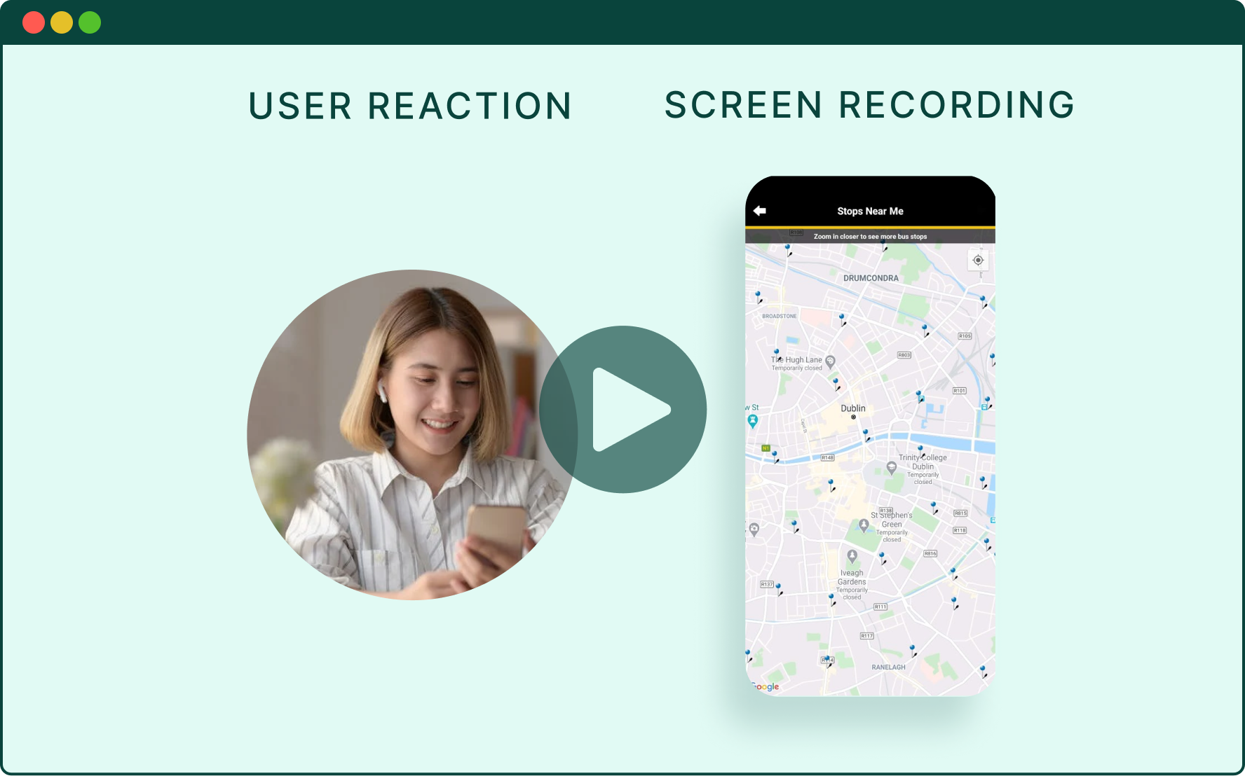
In order to extact more tangible, real-world user experience feedback of the app, two real-world tasks were devised for users to perform while being observed via multiple methods of data gathering.
Combined these methods allowed the concurrent tracking of what the user was seeing, thinking, saying and emoting thoughout the exercise. From a exercise facilitator stand-point, these methods provided more freedom to probe into user reasoning and decision-making and ask non-leading questions — as note-taking could be “fixed in post”.
Key extraction metrics
- Think-aloud feedback technique
- Video recording of user reactions
- In-app screen recording
The end product (after a bit of post-production) for each observed user task was a syncronized video displaying both the screen recording and the user reaction, as well as the audio capturing their think-aloud feedback (example below).
Thematic analysis of app store reviews
To better gauge user opinion and pain points and overall collect more feedback from real-world users, the reviews for both the iOS and Android app were analysed using open coding (as oppsoed to pre-defined codes).
This method of analysis enabled the identification of common themes across both mobile apps versions, which could be easily collated with the themes identified in all previous research methods — either validating or potentially contradicting data already collected.
Major themes identified from app reviews
-
Unreliable information is leading to low levels of user trust.
-
The general user experience of the app is unpleasant.
-
Other apps (predominantly Google Maps) are providing a more helpful service.
Triangulation of mixed research methods
For triangulation between research methods, affinity diagrams were used to plot and cluster research findings. This allowed a picture to build of the common themes across all research methods.
Through doing this, it was discovered that there were parallel themes running through each research method; particularly between the interviews and thematic analysis of app reviews.
Define
Pain points
Out of the user research came quite a few observations (and some outright complaints) with regards to pain points that users have been experiencing on the app.
Much like the questions and assumptions identified at the beginning of the project, these pain points were identified and then plotted on a prioritization grid. This time though, plotted relative to their impact on the user’s experience (impact) and feasibility of completion within the scope of project time frame (feasibility).
From this exercise, it was clear to see that four of the pain points were good candidates for implementation. Going forward, these pain points would bleed into other exercises such as defining user needs and “how might we” statements.
Using the fare calculator is difficult
Conveying real-time data and trust
Conveying the user’s current location
Displaying the routes are passing through nearby
Disjointed search functionality
Easily accessing most used & favourite destinations
Pain points
- Using the fare calculator is difficult
- Conveying real-time data and trust
- Conveying the user’s current location
- Displaying the routes are passing through nearby
- Disjointed search functionality
- Easily accessing most used & favourite destinations
User personas
With the wealth of triangulated quantitative and qualitative insights collected, user personas were now able to be fully fleshed out. Sponsor users came from the across the demographic spectrum, with at least one user from every age bracket between 18 and 65.
Research uncovered positive differences in usage between those at opposite ends of the age spectrum. Younger people tending to be more technologically comfortable and generally used bus as their primary mode of transport as opposed to the older users preferring car and being less disposed with technology.
A persona for both demographics was therefore created — as the needs of all users could not be satisfied by one persona alone.
Say hi to social gen z, Andy.

- Single
- Works in the city centre in the information technology sector
- Uses the app for morning and evening commute
- Lives in Blanchardstown
- Lives far from work so needs to change buses when commuting
- Often goes out after work or at the weekends to the city centre but prefers to get a taxi when it’s late
Meet our busy Ma, Paula!

- Married with two children
- Works part-time while her two children are still in nursery
- Her wife takes the household car to work so uses the app during the day
- Lives in Dundrum
- Takes short trips to the shops or to pick up kids from school
- Prefers to take the bus into the city centre but doesn’t really know the layout of the bus network
Branding and logo
As a warmup design exercise and to help foster a sense of identity and design language for the prototype stage (also for some fun) — I looked at the existing Dublin Bus brand as well as it’s history.
Added to that, I did some “competitor” analysis of successful products in the space as well as successful transit brands around the world.
This would help set a north star for both a new Dublin Bus brand identity and of course the new Dublin Bus app.
Inspired by the best

- The London Underground is one of the most famous transit systems (and brands) in the world
- It’s official symbol is "The Roundel"
- The Roundel has a simple yet distinctive design that gives it both form and function in all of the context which it is found in (print, digital, signage, clothing etc.)
- It is also the symbol for Transport for London (TfL) for which the Underground is a network
- We can elevate the Dublin Bus brand through basic human pattern recognitive by using similar shapes associated to one of the best in class rapid transport can elevate the Dublin Bus brand
And by our past

- As part mood boarding I looked at old photos of Dublin Bus fleets
- I discovered that it’s logo from the 1960s and 1970s era was a simple yet classic design with some roundel vibes
- It was placed on the side of every bus within the fleet like above
- It would also translate itself well to the digital era of today
- We can draw upon this existing heritage to create a logo that feels both old and new
- It’s also important to keep in mind the native Irish language for signage