Case Studies
IBM Security QRadar SIEM
A project to build a brand new user interface and experience for security analysts using IBM Security’s market leading SIEM product.
This project marked QRadar’s first move towards the newly established IBM Design Language — implemented using our Carbon Design System. It also signified a methodology shift towards a more Design Thinking framework for cross-functional team ideation, collaboration and iteration.
Role
On this project, I worked as a UX Engineer. I sat predominantly on the engineering team, while also being involved in many of the design team rituals and critiques. Having that engineering input at an early stage in the design process helped identify things such as technical, accessibility and performance constraints — thus allowing the design team to iterate faster. I was responsible for creating quite a few design patterns and user flows. Then creating them as prototypes and then ultimately implementing them in code. It was very satisfying to take those ideas from that ideation phase to seeing you pull request being approved!
UX Engineer
- Brainstorming and conceptualizing components and design patterns
- Advising on the technical feasibility and accessibility of design choices
- Attending design team rituals, collaborating during ideation and contributing to design critiques
- Developing prototypes and gathering feedback to iterate and improve user interactions
- Ensuring consistent implementation of the design system throughout the project
- Fulfilling all typical technical frontend responsibilities
- Advocating for design requirements at the engineering level to ensure alignment between design and development efforts
- Maintaining a high standard of visual fidelity by ensuring pixel-perfect implementation
Design
Engineering
Context
The IBM Security QRadar Suite is the centrepiece of IBM Security’s product portfolio, and QRadar SIEM is the suite’s most valuable player.
A critical cyber defence weapon in the armoury of any large organisation, SIEM stands for Security Information and Event Management. It's a software solution that provides a centralised platform for collecting, analysing, and managing security-related data from various sources within an organisation's IT infrastructure. The primary purpose of a SIEM product is to provide real-time monitoring, threat detection, incident response, and compliance reporting.
My team ("Spectre") at IBM Security was picked for this project — off the back of building the incredibly popular QRadar Assistant (an app that grow out of an internship project, which I was also part off).
Problem
Within the industry, QRadar SIEM was known for being incredibly powerful under the hood but underdelivered in it’s user interface and experience. This is represented in it’s place as a “Leader” in the Gartner SIEM Magic Quandrant (above) for twelve consecutive years.
Due to those years of underinvestment in both design and user experience, as well as an aging frontend tech stack — the frontend problems with QRadar began to stack up. IBM was also recently invested in the creation on a new IBM Design Language, so the product was now visually out of alignment with the IBM product look and feel.
A full frontend rebuild was required to bring QRadar up to date with modern web technology and the IBM Design Language. This allowed us to completely rethink and redesign to product from the ground up!
A typical investigation
The major use case for QRadar is at a Security Operation Centre (SOC). You’ll know these from movies where there’s some kind of cyber attack and it cuts to a dark room or command centre that has a wall of digital screens displaying command line interfaces and data visualisations. This is a stereotype by the way, and not what all real-life SOCs looks like. But they are indeed real places and critical in responding to incidents — and in QRadar’s case, offenses.
Very large organisations will tend to have their own SOC and medium to large organisations might only have a team of Security Analysts. Either way they are tasked with investigating an “offense” within their organisation network. While triaging or during an investigation, on the old UI — an analyst would have to inspect or pivot to different parts of QRadar at a time. However, in order to do this they had to open new those different parts in new windows. Leading to “window spagetti”. Below is a representation of that from a playback that I presented to various stakeholders during the project.
User feedback
Loss of context
“What was that IP again?”
Excessive cognitive load
“I don’t remember where I go to…”
Easily getting lost
“I have so many windows open in QRadar that after a while I don’t even know what I’m doing”
Break in workflow
“I have to restart building my query because I went to another tab”
Difficulty in tracking investigations
“Have I followed through on everything I intended to?”
Goals
Goals and definitions of success were set from a business (high) level as opposed to a product (low) level. This isn’t always ideal but in this case, from a design and engineering perspective, it actually left quite a bit of scope for ideation and creativity. The business were very receptive to evolving the product and doing things differently due to the greenfield nature of the project. Below are the high-level goals that were defined by the business.
Streamline offense management
Accelerate triage processes with easy to understand insights and deep dives into your security data.
Integrate new IBM Design Language
Built using IBM Carbon design language with an emphasis on usability and accessibility
Consolidate investigation experience
Easily triage, investigate and search on indicators of compromise (IOCs) from a single interface.
Design
Design patterns
A greenfield project like this one creates the possibility to rethink and reimagine existing patterns of user experience not only within the product but the problem space. And as mentioned, the business were very receptive to this. One of my favourite aspects to my role was being involved in this ideation and iteration process.
At IBM, we used the Cake Experience Roadmap to iteratively design experiences. Focusing first on a Cup Cake version of the experience which addresses the priority pain points, then iteratively expanding and improving the experience based on stakeholder feedback. After a number of rounds of iteration ending up with a Wedding Cake.
An example of a design pattern that I am particularly proud of creating is 'Customize Columns' (below). This was a solution to problem that due to the amount of data points associated to an offense — the data table of offenses had hundreds of possible columns. We therefore had to design a way to allow users to customize the data table columns by selecting from the hundreds of possible columns.
Cup cake version of customize columns
Wedding cake version of customize columns
Prototyping
As demonstrated through the implementation of the 'Customize Columns' design pattern (above), prototyping played a significant role in my contributions to the project.
During this development phase, we effectively demonstrated the latest features and UX patterns of the new IBM Design Language to stakeholders who were not yet acquainted with it. Additionally, it provided an opportunity for faster, low-stakes testing and feedback collection. By designing specific user flows in isolation, we were able to test precisely what we wanted without the need to invest resources in building a full MVP in code.
Over the course of the project I was able to try out a few prototyping tools (below), which was fun.
Prototyping tools
Sketch
Our primary design tool used throughout IBM Design. The Carbon Design System team had created a design kit for Sketch, which helped speed up high-fidelity design iterations.
Additionally, the other tools in this list all provided the ability to import designs from Sketch. This was very helpful because Sketch is known more for it’s static design features as opposed to the prototyping features of the other tools.
This meant that I was able to start my prototyping process in Sketch where I could make use of the design kit from Carbon Design System — then import to a tool that was better suited for prototyping.
InVision Studio
IBM acquired an enterprise team licence for this tool during the project. However it never became a full-time tool at the company due to Sketch’s superior features, plugins and our existing investment in our design kit for Sketch.
It did however have more powerful prototyping features than Sketch, such as timeline animations and transitions. This allowed us to create high-fidelity interactive prototypes of user flows that we could share via a link to external to stakeholders.
This allowed us to showcase more extensive user flows and experiences while gathering asynchronous feedback — a big improvement on our previous workflow.
Principle
For more complex user interactions and animations, I used Principle. This tool allowed for fine-grain animations and transitions for prototypes with added complexity and fidelity. Also provided the ability to share a link to prototypes for external stakeholders.
Flinto
After exploring Flinto, I found it to be highly useful for prototyping for mobile gestures and interactions. You can get very granular with touch gestures and interactions, which allows you to create some very fluid and delightful prototypes. However, given the desktop-centric design of QRadar, I found limited applicability for Flinto in my workflow.
Design critiques
Operating within a Design Thinking environment, the design took part in weekly design critique sessions between the wider design team within IBM Security.
This provided opportunity to identify potential overlap and misalignment and improve overall visibility between IBM Security products. Because each design team was working within the same domain (cyber security) and within the same bounds of the IBM Design Language and Carbon Design System— we were able to convey context very easily without every single member of the design team knowing the ins and outs of each others products.
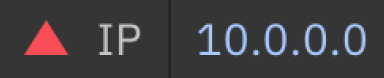
For example, across the various IBM Security product suite there is the concept of magnitude and severity. It is a quantifiable rating relating to the level of importance, risk or threat associated to a given item or event (e.g. IP address, offense, asset). We identified this common paradigm and the misalignment in how we convey this to our users across the IBM Security product suite (often sold and used together).
We then came together to align on a standardised way of score and display magnitude and severity (below). This was a rating from 0 to 10, with standardised ranges for severity levels (below). Each level had its own associated colour and shape to easily indicate to the user. This improved the consistency of the user experience and ease of context shifting for power users who pivot between different IBM Security products within their daily workflow.
Magnitude and severity within IBM Security
This is an example of how we standardised the severity of the risk associated with an IP address. It was then programatically standardised in the IBM Security component library consumed by development teams across the business unit.
Low (0-4)

Medium (4-6)

High (6-10)
Engineering
GraphQL server
One of client-side challenges that we wanted to address was that we the old UI relied on consuming multiple APIs (from across the business unit) and and piecing together the response data to build the UI. In reality this lead to poor performance metrics such as Time to Interactive, Cumulative Layout Shift and general over-fetching of data.
To address these issues, we opted to create a GraphQL server using Apollo GraphQL to combine the various APIs into a single entry point for our client. This would prevent over-fetching, and simplify loading and error state management.
Carbon Design System
As mentioned, IBM had invested heavily in the creation of the new IBM Design Language. And Carbon Design System was the productised technical implementation of the design language.
Carbon has a few frontend library implementations at the time, but by far the most mature and best maintained was their React implementation. This played into our team’s preference for React.
Carbon Design System was created to be used by product teams across IBM, but IBM Security required some bespoke components and patterns for it’s products. With the IBM Security business unit, we created our own child implementation of Carbon Design System called Carbon for IBM Security.
This descendant mostly simply imported and exported all of the components that you’d get with Carbon Design System, but additionally built and exposed some IBM Security product specific components and patterns. These could be used across product team within the IBM Security business unit such as the QRadar Suite, Guardium and MaaS360.
Next.js adoption
As a development team, we made the decision to build using React with the Next.js framework. While this decision felt like a significant leap at the time, considering Next.js was not as widely recognized as it is today, it ultimately proved to be the right choice.
Despite encountering some initial challenges with Next.js, particularly in its earlier stages, we found that its advantages outweighed any drawbacks. Next.js offered excellent routing capabilities, performance enhancements, a robust ecosystem, and an overall pleasant developer experience. Given the scale of our project, opting for a frontend framework was imperative, and Next.js emerged as the optimal solution.
One of the niceties of Next.js was the folder structure routing. This allowed our team to easily define dynamic routes for QRadar that users can easily share with each other. This is a feature that was previously not possible with the previous UI.
IBM Equal Access Accessibility Checker
This project was fortunate enough to be involved as a test environment for a new accessibility tool that was being developed by the IBM Accessibility team.
We were given early access to the IBM Equal Access Accessibility Checker, which is a web browser extension for checking accessibility issues — as well as a Node package that integrates int you testing and CI/CD process.
We were indeed able to integrate this into our CI/CD process as well as implement quarterly accessibility reporting for the product. These results were tracked in order to quantify progression or regression in accessibility standards over time.
Impact and outcomes
Given the immense scale and power of the existing QRadar UI, this project marked merely the initial step in reshaping the QRadar experience. Our attention was directed towards enhancing three key features to deliver maximum user value.
Key features and impact
Offenses
QRadar allows you to configure criteria called “Rules”. The criteria is matched against events that occur on your network. Once the criteria is matched (i.e. rule is broken) — a brand new offense is triggered and created on your QRadar instance for an analyst to triage and/or investigate.
None of this was new, but in the new UI we changed how offenses were visualised, navigated, shared, sorted, and filtered. The focus on eliminating context shifting was appreciated as now users were able to pivot and peak quickly from one piece or information to another.
Below is a detailed review of Offenses by Jose Bravo, a well-known member of the QRadar online community.
Search
A foundational element of QRadar is the ability for power-users to write queries using Ariel Query Language (AQL). In the existing UI, this was a manual user experience — the user needed to be fluent in AQL to write queries and search.
A brand new paradigm feature that we created was “Query Builder”. This was an assistive user experience that provided typeahead functionality to the user’s search experience. This opened the door for non power-users to write AQL, while lower the barrier for entry for non-technical users of QRadar. This was a game changing feature for the product.
Below again is a detailed review of Search by Jose Bravo.
Applications
One of major features of QRadar is it’s ecosystem of first and third-party applications. The QRadar community is quite large and we had invested heavily in our QRadar App SDK — to great success. There are now over 400 QRadar applications available to download on the IBM X-Force App Exchange.
These apps were so deeply ingrained into our users workflows that is was essential that we bring them across as first-class citizens of the new user experience. With this in mind we ensured that any applications that a user had installed into there existing QRadar instance were instantly available when they moved across to the new UI.
Again this was a welcomed feature and one which actually performed better on the new UI than the existing UI due to the capabilities of the modern stack that we used vs the legacy stack of the existing UI.